The impact
Faster hand-offs between design and developement
decrease in design-related bugs across first quarter of roll-out
accessibility compliance according to WGAG 2.1 AA standards
The challenge
When I first joined Sharp, it was widely known there was inconsistency across Sharp's many products. As the system has grown over the years, there emerged different teams, tools, and workflows that created fragmented user experiences. Some challenges from a design perspective included:
• Components were duplicated across products (and inconsistent)
• Design decisions were often made page-by-page rather than system-wide
• Spacing, typography, and color usage varied significantly
• Accessibility standards were not prioritized
• Designers and developers lacked a shared source of truth
The result was visual inconsistency as well as operational inefficiencies that slowed delivery, increased QA/UAT time, and made scaling difficult across our various teams.
At the same time, Sharp wanted to modernize its digital infrastructure. This all led to us migrating from Sketch and CommonSpot toward a more scalable ecosystem. The goal became much larger than creating reusable components. We needed to build a scalable design system that could align design, engineering, accessibility, and content workflows across the organization.
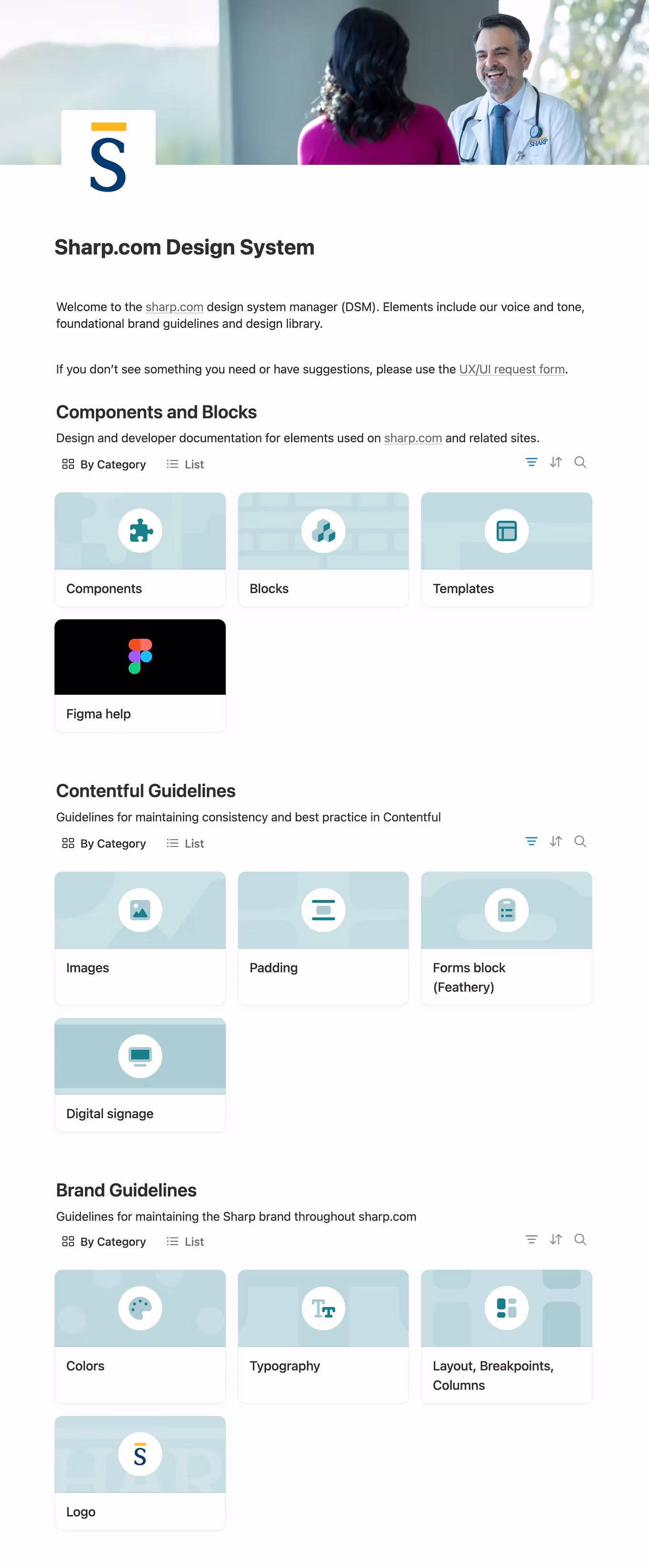
Establishing a shared foundation
As lead designer on the initiative, my role centered on helping define:
• The system architecture
• Component strategy
• Documentation approach
• Design-to-development workflows
• Long-term scalability and governance
.png)
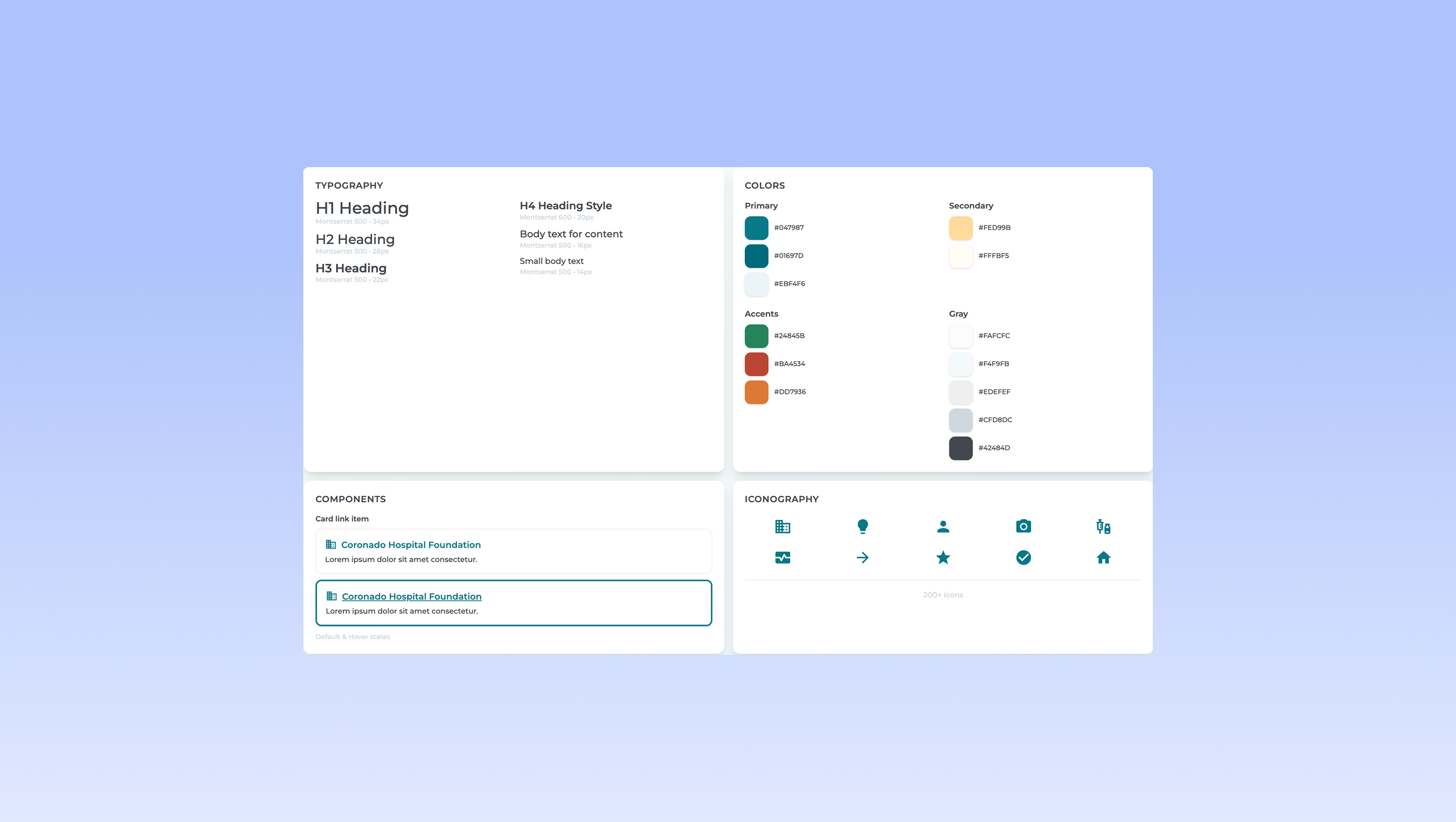
We approached the system through an atomic design methodology, starting from the atoms all the way to blocks and templates. Some details we defined included:
• Design tokens
• Typography
• Color
• Buttons and form elements
• Components
• Patterns
• Larger content blocks and page structures
This process allowed us to create consistency at scale while still supporting flexibility across different products and teams.
Designing the system for accessibility and scale

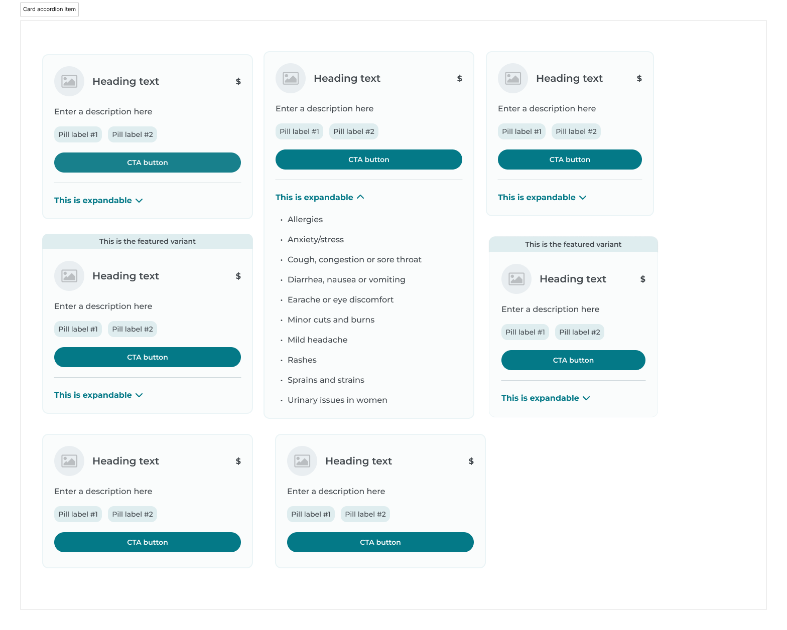
Building the component ecosystem
The goal was not simply to standardize existing patterns, but to evolve the system into something more scalable and future-friendly.
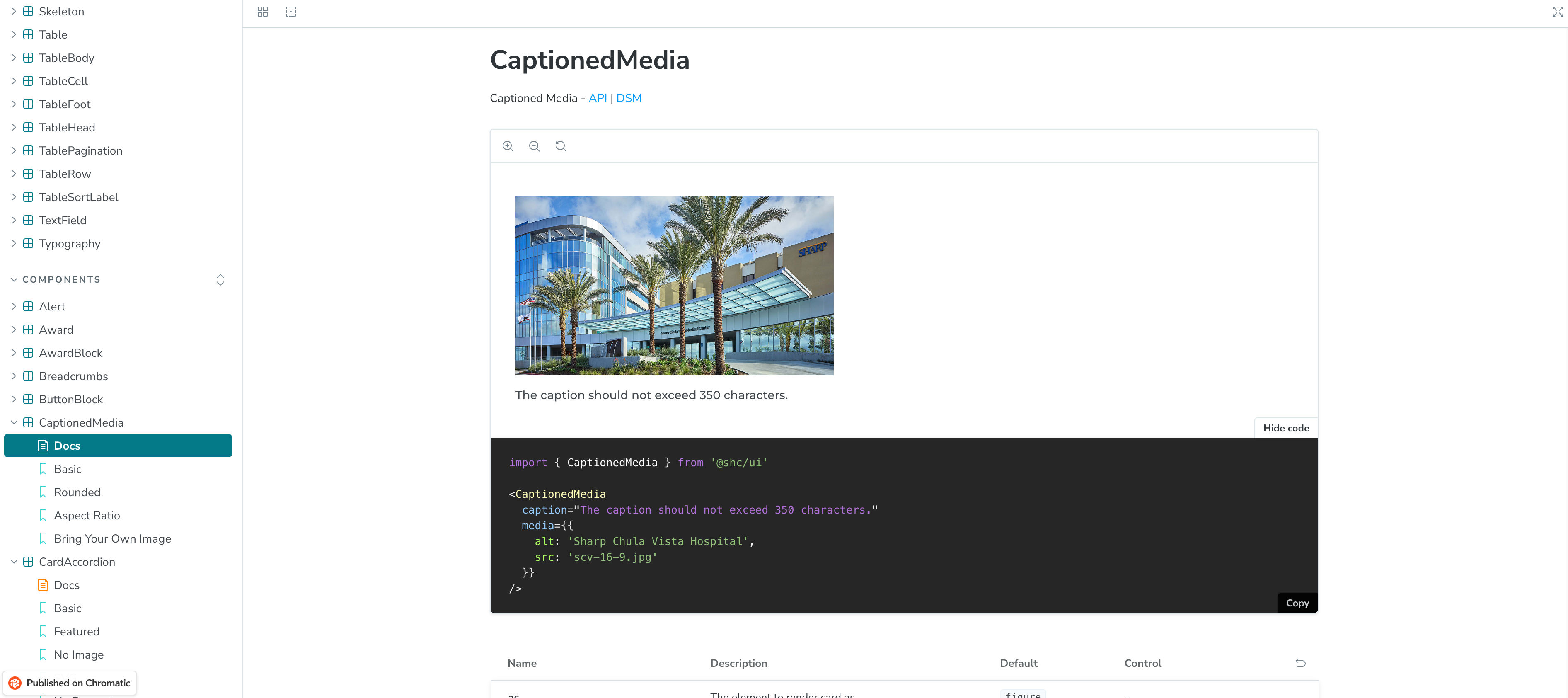
Documentation as part of the product
• Purpose and intended usage
• Accessibility considerations
• Interaction guidelines
• Figma embeds
This significantly improved onboarding, collaboration, and implementation consistency across teams.

Aligning design and engineering workflows

Storybook integration
We also integrated Chromatic for automated visual regression testing, helping both design and engineering teams to approve changes and bug fixes. This dramatically improved confidence during implementation and reduced manual QA overhead.
Impact
- • 40% quicker design-to-dev hand-offs thanks to tokenized styles and resuable patterns
• Design QA/UAT rounds cut in half with fewer consistencies between Figma and production
• 60% fewer design-related bugs across the first quarter of roll-out
• 95% accessibility compliance as flagged my Lighthouse and other QA accessibility tools
Reflection
By investing in accessibility, documentation, scalability, and developer collaboration from the beginning, we built a foundation that continues to evolve alongside Sharp’s growing digital ecosystem.