Locations rebuild
Role: UI/UX designer
Company: Sharp Healthcare
Timeline: June 2023 to Sept. 2023
Defining the problem and identifying opportunities
Sharp HealthCare is a huge medical system with several acute care hospitals, multiple specialty care hospitals, as well as labs, clinics and more. We also have multiple medical groups within our system. We wanted to provide patients an easy and streamlined way to find the care they need and get to the right places with as little confusion as possible.
As part of our CMS migration effort from CommonSpot to Contentful, we took the time to thoughtfully rehaul our Locations strategy on sharp.com.
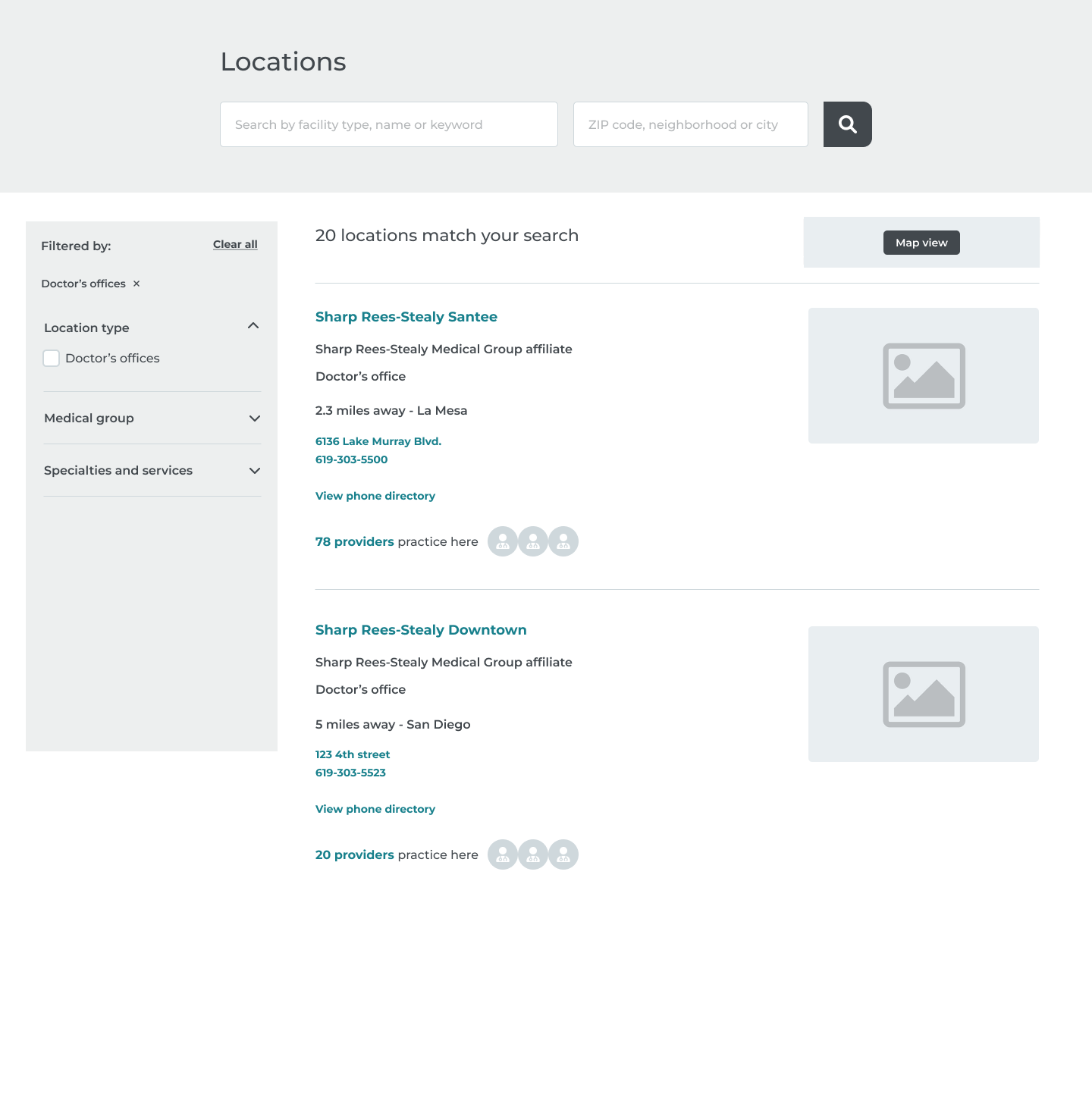
Our new locations experience now includes a search tool powered by Algolia and includes new features including:
- • A new landing page featuring location types and the ability to search
- • Search results with filtering tools
- • Ability to filter by insurance and location types
- • Search results feature walk-in wait times for urgent cares
- • Search results also feature clear CTAs including "book appointment" and "save my spot."
- • Location detail pages featuring the most important info patients are looking for in their search
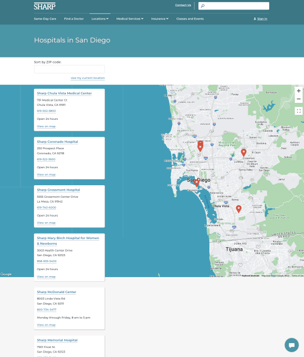
Our legacy site pre-redesign
- • Limited to no search function
- • Cluttered results with no ability to filter or sort
- • Piecemeal information located across multiple pages for single locations
- • Poor mobile responsiveness
Creating wireframes
Wireframes were created informed by existing information on our legacy site as well as the new functionality and features required of our redesign. Competitive analysis of other healthcare systems and healthcare websites also helped define common patterns that would be intuitive for users.
Usability testing
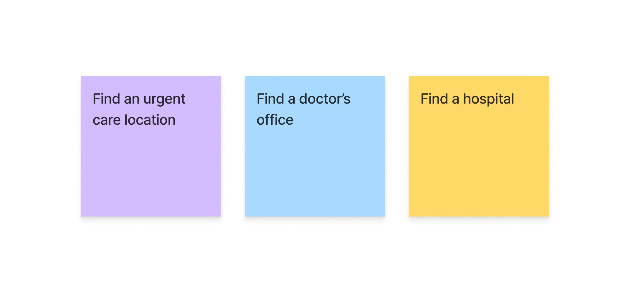
We conducted six moderated user testing sessions with three different tasks to gather insights regarding our new locations flow and design
Each user was given three different tasks to complete during the testing session
We came into testing with a few hypotheses outlined:
- • Users will appreciate the filters and easily be able to sort for the locations they need.
- • The hospital location pages will provide the key information patients are looking for and feel confident selecting that facility for care.
- • When looking for a doctor’s office, patients will likely want to navigate to see doctor’s available at these locations.
- • When looking for a specific department, patients will know where to look and be able to access the info they need without clicking into a detail page.
Synthesizing the results
We mapped out the results observed across users and organized them into an effort/value matrix.
Delivering the MVP
Feedback received from users as well as business needs were considered in the final deliverable for MVP. Items prioritized included:
- • Providing users with the most pertinent information in a clear way (full address with link for directions, phone number, etc) and removing clutter that was not deemed as valuable
- • Featuring walk-in wait times and save my spot prominently
- • Displaying medical groups near the top of the detail page as medical groups often brought some level of confusion
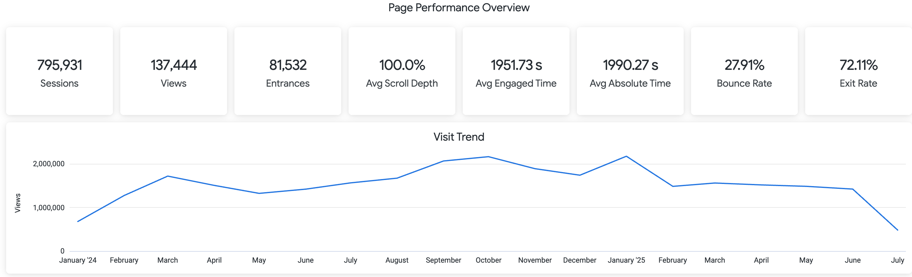
Outcomes
Measured in the first quarter post-launch:
- • Achieved 28% reduction in bounce rate
- • Most clicked CTAs included "get directions" and "check wait times" which was aligned with testing
- • Logged over 3000 clicks on "on my way" and over 2700 clicks on "save my spot" indicating quick adoption and usability
- • 67% of users engaged with location filters
- • Filter users were 2.4% more likely to proceed to a CTA (get directions, save a spot, etc)