The impact
Positive impacts were made in both patient conversion and engagement
25%
increase in online appointments booked through eligible provider profiles
increase in online appointments booked through eligible provider profiles
20%
increase in engagement with provider profiles
increase in engagement with provider profiles
63%
of users actively refined results using filters
of users actively refined results using filters
18%
increase in mobile conversion rates
increase in mobile conversion rates
The opportunity
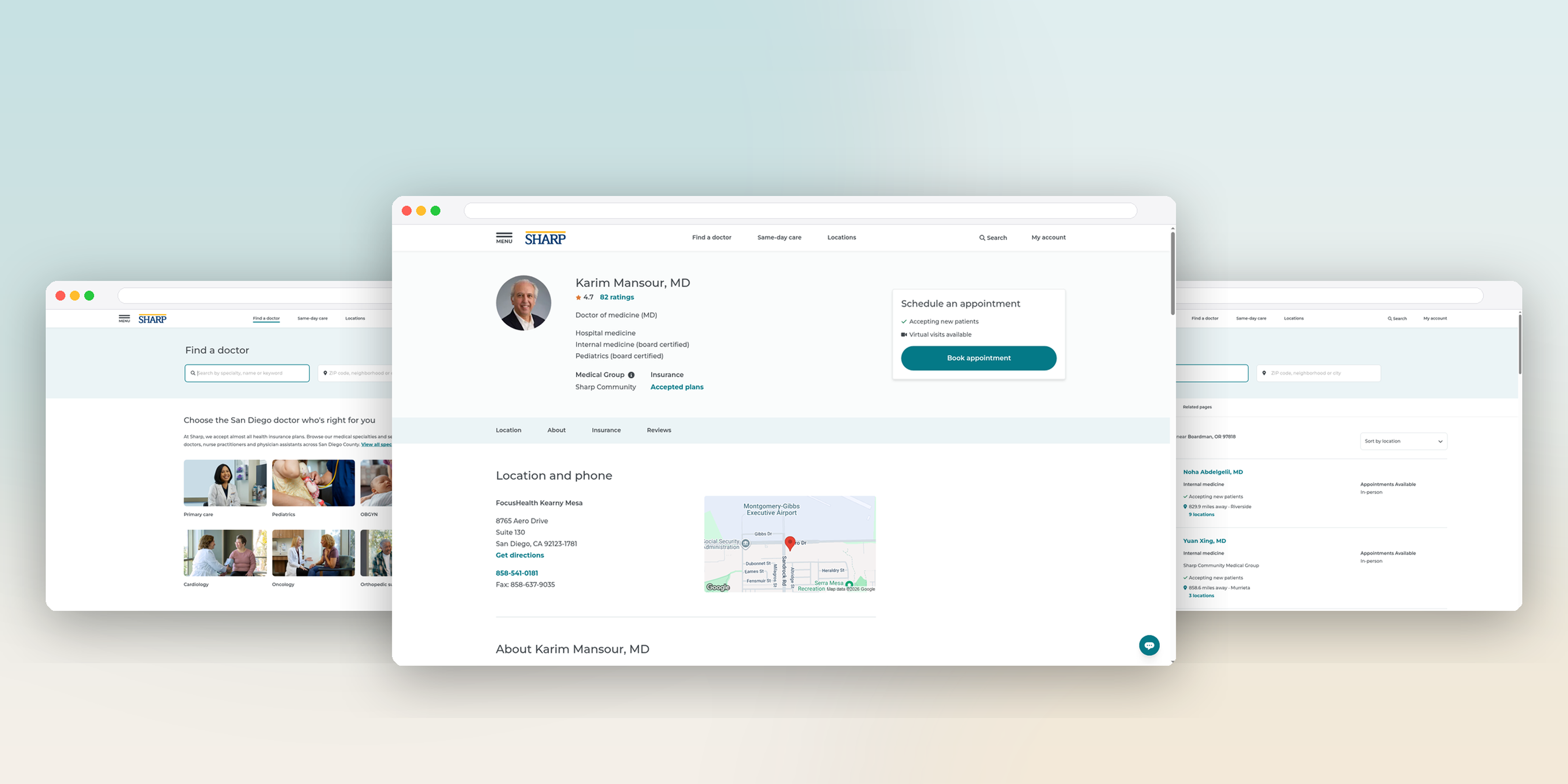
Finding the right physician is one of the most important decisions patients make, yet Sharp had never built a cohesive digital experience to support that journey. While basic provider pages existed, there was no intentional product designed to help patients discover, evaluate, and confidently choose the right doctor. Our team had the opportunity to define Sharp’s digital care discovery experience from how providers should be organized and searched to what information would help patients make confident healthcare decisions.
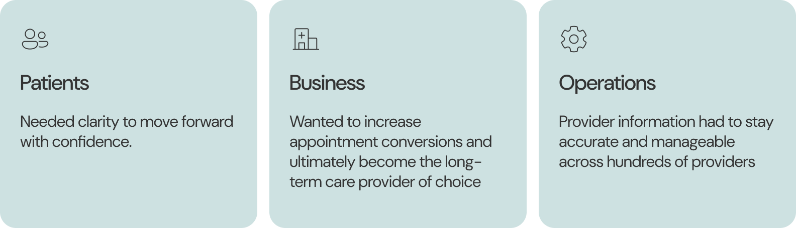
Help patients find the right provider faster with greater clarity, confidence, and trust while balancing business needs and considering operational complexity.
Product principles
Decision support: Patients didn't just want a list of doctors, they needed confidence they've chosen the right one
Progressively reveal complexity: Information should appear when it’s most valuable.
Build trust through transparency: Provider information should be clear, current, and easy to understand.
Design for scale: The experience needed to support thousands of providers while remaining maintainable for internal teams.
Discovery and understanding the problem space
Before exploring solutions, we needed to understand why patients struggled to find the right physician. This meant looking beyond usability to understand how patients made healthcare decisions, how provider information was maintained internally, and where operational constraints influenced the experience. I partnered with researchers, content strategists, clinicians, schedulers, and business stakeholders to understand the ecosystem from multiple perspectives.
It was important to define what digital care discovery should look like. Some foundation questions that arose were:
• How should users search for care?
• What information actually influences physician selection?
• Which provider attributes are the most important to users?
• How should provider info be surfaced and organized?
• How do we balance patient needs with operational complexity?
It became clear during discovery we needed a search and discovery experience but that was just the tip of the iceberg.
It was important to define what digital care discovery should look like. Some foundation questions that arose were:
• How should users search for care?
• What information actually influences physician selection?
• Which provider attributes are the most important to users?
• How should provider info be surfaced and organized?
• How do we balance patient needs with operational complexity?
It became clear during discovery we needed a search and discovery experience but that was just the tip of the iceberg.
Listening to the users
.png)
Designing for a B2C product meant a diverse set of users who had varying levels of comfortability with healthcare, technology, and responsibilities. The strategy for this project in particular focused on a prospective patient and a potential customer coming in for a specific service.
Lorin the prospective patient needs clarity regarding how insurance works and wants clear steps to establish care with a primary care doctor. She is a busy parent who manages her family's care as well.
Pains:
• Confusion with health care and health insurance
• Limited access to bilingual providers and services
• Lack of efficiency when managing family care
Needs:
• Convenient health care services when she needs them
• Personalized and quality family health care
• To search for providers that speak their language
• Same-day care when a need arises
Alex the customer through a specific service is looking for a doctor to perform a procedure that uses modern treatments with high-quality care. He has a busy schedule and wants quality medical care quick.
Pains:
• Misinformation or incomplete information
• Time-consuming wait times and scheduling
• Quality of care not meeting expectations
Needs:
• Quality medical care for his main concern
• Efficient online research and decision-making supports
• Seamless and quick health care experience
Lorin the prospective patient needs clarity regarding how insurance works and wants clear steps to establish care with a primary care doctor. She is a busy parent who manages her family's care as well.
Pains:
• Confusion with health care and health insurance
• Limited access to bilingual providers and services
• Lack of efficiency when managing family care
Needs:
• Convenient health care services when she needs them
• Personalized and quality family health care
• To search for providers that speak their language
• Same-day care when a need arises
Alex the customer through a specific service is looking for a doctor to perform a procedure that uses modern treatments with high-quality care. He has a busy schedule and wants quality medical care quick.
Pains:
• Misinformation or incomplete information
• Time-consuming wait times and scheduling
• Quality of care not meeting expectations
Needs:
• Quality medical care for his main concern
• Efficient online research and decision-making supports
• Seamless and quick health care experience
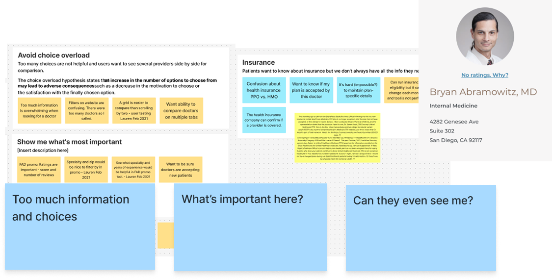
Research showed the current directory gave too many options but no support to make a choice. Users repeatedly reported:
"Too many options"
"Don't know where to begin"
"What is even important?"
"Too many options"
"Don't know where to begin"
"What is even important?"
Designing the care discovery journey
Three different product decisions surfaced across the user's journey.
.png)
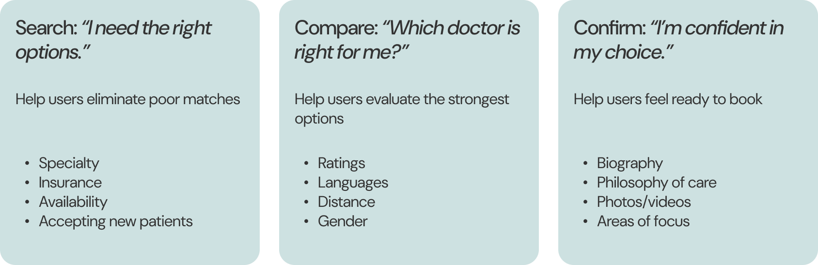
Each decision required a different strategy but together they helped our users and potential patients move confidently from search to scheduling
Mapping information to the users decision-making journey
One of the foundational product decisions was determining when information should appear, not simply what information to show. Through research synthesis, I identified three distinct stages patients naturally moved through attempting to choose care. Rather than exposing every provider attribute upfront, I progressively revealed information to match each stage of decision-making.
Surfacing the right information to support guidance and reduce cognitive load
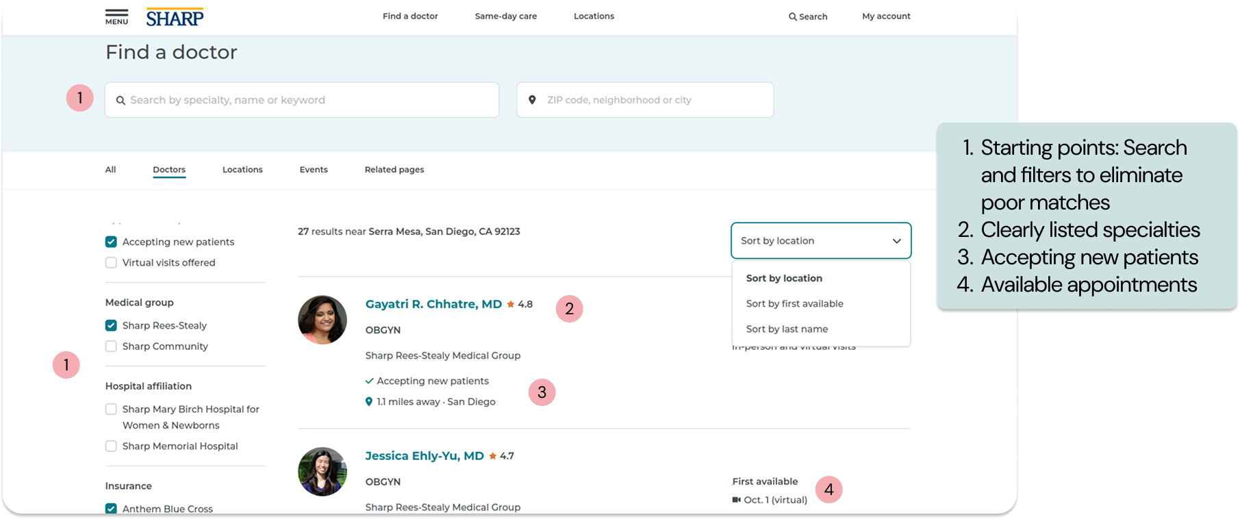
I established a progressive information hierarchy that helped patients narrow choices without overwhelming them. Early interactions focused on eliminating poor matches through specialty, insurance, accepting new patients, and availability. Richer provider information was introduced only after patients had narrowed their options.
Designing for confidence
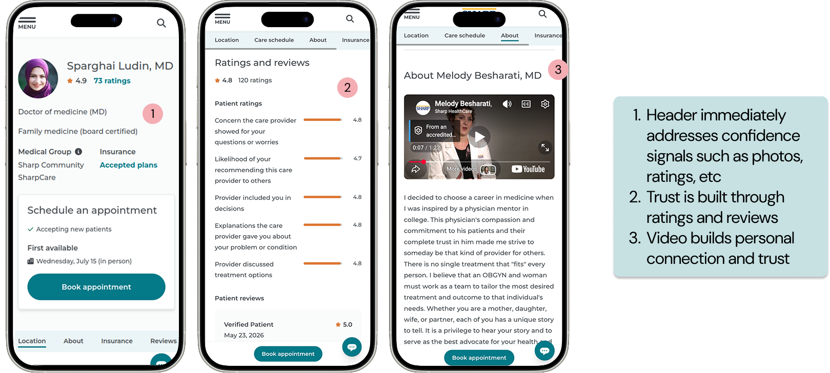
Users needed confidence indicators after their choices were narrowed. Confidence came from reassurance a doctor matches their needs in order to move foward with confidence. Some confidence indicators included in the design were:
• Provider specialties and areas of focus
• Languages
• Credentials
• Provider bio + video
• Reviews
• Provider specialties and areas of focus
• Languages
• Credentials
• Provider bio + video
• Reviews
Designing the platform behind care discovery
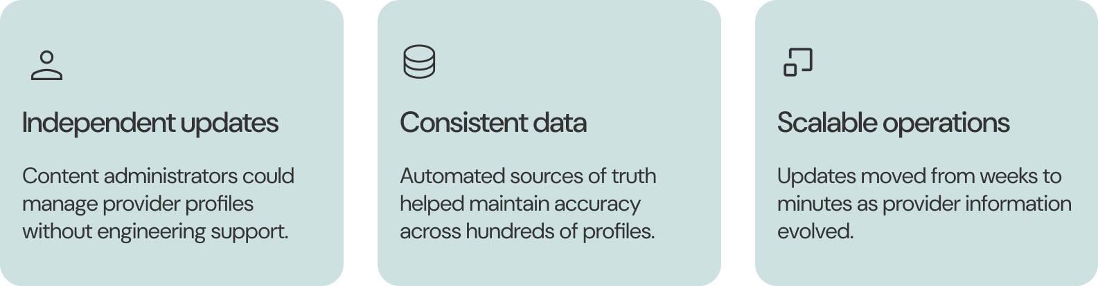
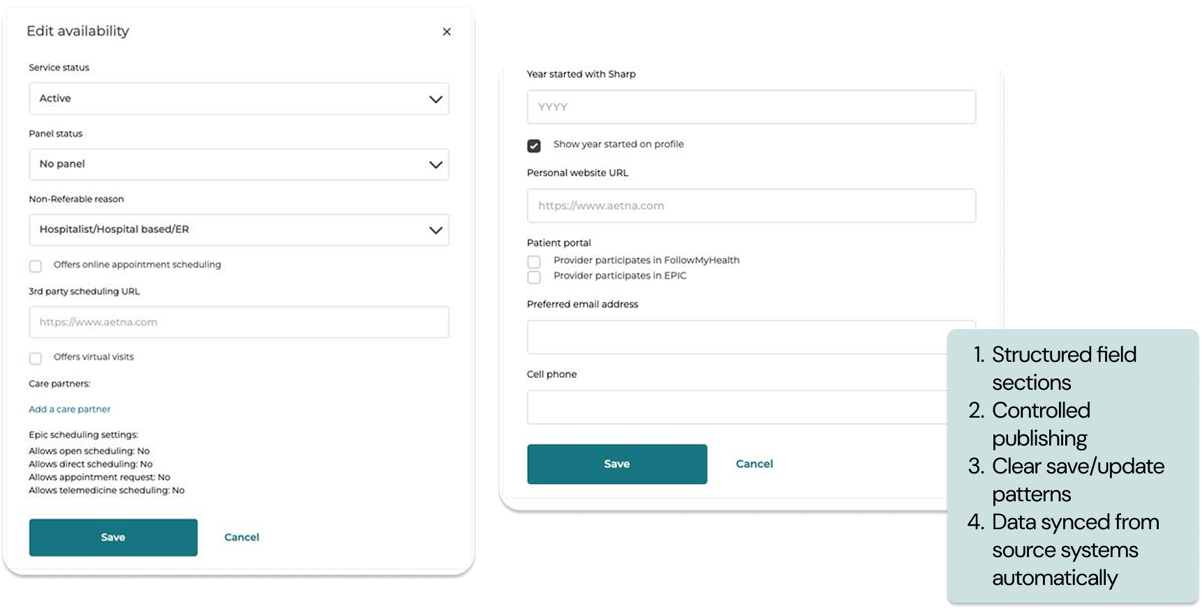
Creating a trustworthy care discovery experience required equally thoughtful tooling for internal teams.T o keep provider information accurate and scalable, I designed a provider administration platform that enabled content editors to manage provider data independently without relying on engineering.
Provider Admin Tool: operational trust at scale
In creating this tool, I collaborated closely with the admins that would be utilizing this to make sure this tool was simple to use. The goal was to make it as simple as possible as these administrators were not technical users. The tool also regularly synced certain data from source systems.
Outcomes
The experience launched as part of Sharp’s broader digital modernization initiative. Within the first quarter, patients engaged more deeply with provider information, abandoned the journey less often, and were more likely to continue toward scheduling.
• 25% increase in online appointments booked through eligible provider profiles
• 26% reduction in bounce rate
• 20% increase in engagement with provider profiles
• 63% of users engaged with filters during search
• 18% increase in mobile conversion rates
• 25% increase in online appointments booked through eligible provider profiles
• 26% reduction in bounce rate
• 20% increase in engagement with provider profiles
• 63% of users engaged with filters during search
• 18% increase in mobile conversion rates


Reflection
This project reinforced how deeply UX impacts trust in healthcare. Patients are often navigating care decisions during stressful or uncertain moments. Confusing terminology, inconsistent layouts, and hidden actions can result in hesitation or abandonment from our users.
By simplifying the search experience, improving consistency, and designing around patient decision-making behaviors, we transformed Find a Doctor from a fragmented provider directory into a more intuitive and supportive entry point into care.